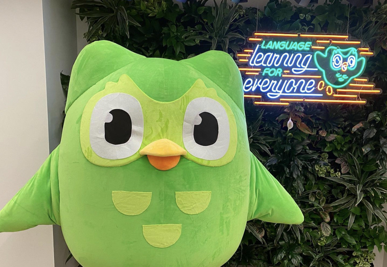

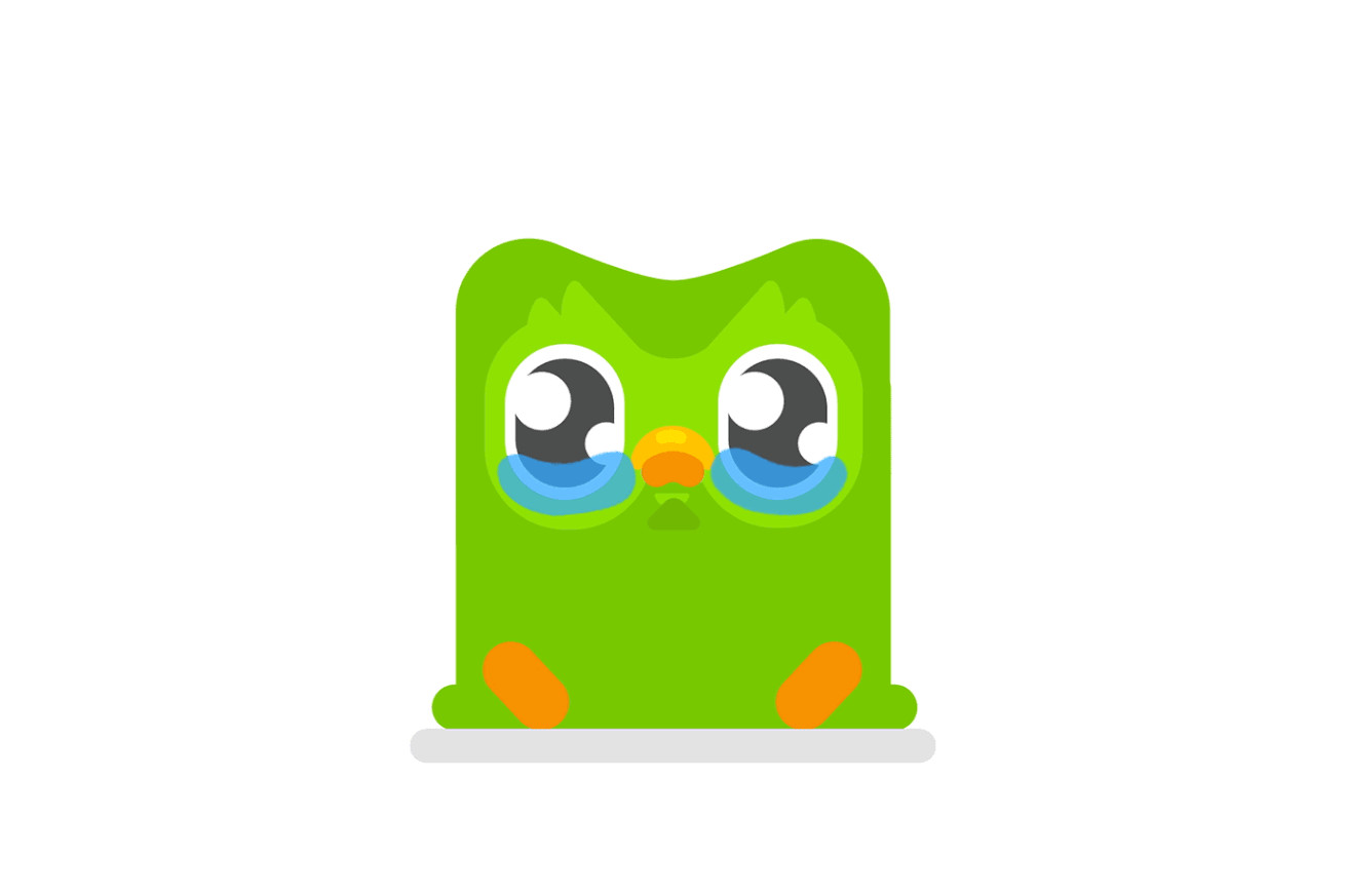
Duolingo, the language-learning platform, has been receiving a wave of criticism since the release of its new app icon that looks 'sick.' The original Duo logo is typically depicted with a calm and cheerful demeanor. Anyone familiar with the language learning app Duolingo knows that its mascot, Duo the green owl, can be quite... demanding. Duo frequently guilt-trips users into completing their daily language lessons with his persistent, chirpy notifications. However, sometimes he expresses his emotions more directly without using words. Recent users of the app might have noticed that the green owl appears a bit unwell. This is probably not a sign of avian flu but rather a physical status update from Duo to encourage users to stay active.
In the updated app icon, Duo has red eyes, a sweaty brow, and a runny beak, giving the impression of being ill. The iPhone widget also portrays the owl as swollen and despondent, with another widget displaying a message that says "Tap to revive!" alongside an image of Duo lying on its back, seemingly lifeless. People took to social media to voice their disapproval of the changes, with one user even stating, "I actually had a panic attack." "I saw this icon today and deleted the app," a second user said. "Honestly, don't want anything that disgusting on my home screen." Despite the backlash, many users soon realized that it was part of a marketing strategy. "They’re trying to get people to post online about the app and it’s working quite well," one Reddit user noted.
Duolingo has previously made sudden design changes, such as in April when the mascot, Duo the Owl, was shown with heavy bags under its eyes. At that time, the company explained that Duo was "literally exhausted from doing everything he can to remind learners to do their lessons." Last October, the app drew attention again with an icon that appeared to be melting. Duolingo assured users that this design was temporary and intended to "encourage learners to open the app." This latest change in Duo’s expression is only visible to users with the most recent version of the app, so if your owl looks fine, you might need to update. There are a few ways to change the ill Duo icon, but these options are only available to specific users.
First, Super Duolingo or Duolingo Max subscribers have the ability to switch to multicolored Super or Max-themed icons. To do this, tap the Duo icon at the top right of the screen, scroll down to "Super App Icon" or "Max App Icon," and tap "Turn On." Members of Duolingo’s exclusive Streak Society can also customize their app logo to an orange Duo with burning eyes by following the same steps. To join the Streak Society, you need to have maintained a streak of app usage for at least 50 days. Duolingo is a free app designed to help users learn new languages by mastering words and phrases. It offers game-like study tools through short, interactive lessons. Users can select from over 40 languages to learn from the beginning or to refresh their existing skills in a second language.
The Duolingo Owl's Ill Appearance: A Marketing Strategy
Duolingo's recent redesign of its app icon, featuring a sickly owl, has sparked widespread discussion and debate among users. While some have expressed concern and even disgust, others have recognized it as a clever marketing ploy. The app's history of sudden and attention-grabbing design changes, such as the "exhausted" and "melting" owl icons, suggests that this latest iteration is part of a calculated strategy to boost engagement.
Why the Sick Owl Icon?
The choice of a sickly owl icon is a deliberate attempt to evoke a sense of urgency and concern. The image of a sick mascot, especially one as iconic as Duo, is likely to trigger an instinctive response from users. This, in turn, encourages users to open the app and check on Duo's well-being, potentially leading to increased engagement with the platform.
A History of Creative Marketing
Duolingo's creative marketing tactics are well-documented. The company has a history of using unconventional methods to grab attention and promote its app. In April 2024, they introduced an icon featuring Duo with bags under his eyes, attributing his exhaustion to reminding learners to complete their lessons. This, again, played on the user's sense of guilt and responsibility towards the mascot.
The melting owl icon introduced in October 2023 served a similar purpose. It was designed to be a temporary change, but its novelty and unexpectedness sparked widespread conversation, prompting users to open the app and engage with the platform.
The Sickly Owl's Impact on Users
The sick owl icon has had a mixed reaction among users. While some have expressed concerns about its aesthetics and found it disturbing, others have appreciated its humorous and attention-grabbing nature. The online discourse surrounding the icon has been largely positive, with many users discussing the change and speculating about its meaning. This, in itself, is a testament to the success of Duolingo's marketing strategy.
More than Just an Icon
The sick owl icon is more than just a visual change. It represents a shift in Duolingo's marketing approach. The company is moving beyond traditional advertising and embracing a more interactive and engaging strategy. By creating a sense of curiosity and conversation, Duolingo is able to connect with users on a deeper level and ultimately drive engagement with its platform. The sick owl icon may be a temporary change, but its impact on users and the way they perceive the app is likely to have a lasting effect.
The Future of Duolingo's Marketing
The success of the sick owl icon suggests that Duolingo is willing to experiment and push the boundaries of traditional marketing. This bold approach is likely to continue in the future, with the company exploring new and innovative ways to engage users and promote its app. The sick owl icon is just one example of Duolingo's dedication to creativity and innovation, and it's sure to be followed by many more unconventional and attention-grabbing campaigns in the years to come.
Conclusion: A Sickly Icon, a Healthy Brand
Duolingo's sick owl icon is a testament to the company's commitment to engaging and innovative marketing. The change has sparked a conversation among users, generating excitement and interest in the app. While the icon may be a temporary change, it has successfully achieved its objective of raising awareness and driving engagement. As Duolingo continues to explore new ways to interact with its audience, the sick owl icon stands as a prime example of the power of unconventional marketing tactics.